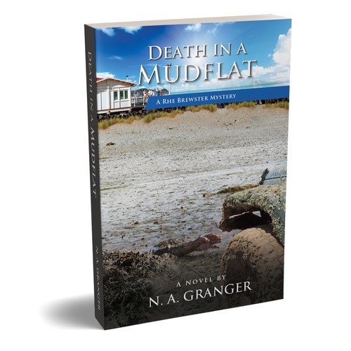
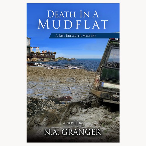
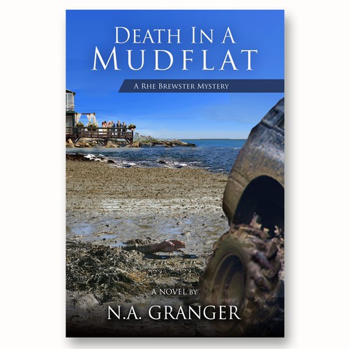
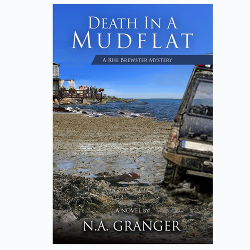
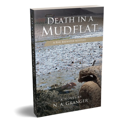
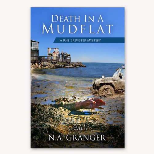
My fourth book, Death in a Mudflat, is in its (hopefully) final edit. The story begins with the marriage of Marsh Adams (Medical Examiner) to Belladonna Zundic (a member of the Maine Major Crimes unit) on a pavilion on the beach in Pequod. The guests are drawn to the noise of Jeep, whose owner is trying to extricate it from a mudflat. With all of the spinning and mud flying, an arm is revealed in the mud.
Here are my final selections for the cover. Would you left me know which one you prefer? Just put a number into your comments.
1.
3.
4. 
5.
![]()
No. 6 gets my vote.
I like number 6.
I really like no 3… I love the sound of the story too! 💜
#1 or #5
I’ve always picked the one you finally chose, so I am loathe to let on to your gentle readers what will inevitably be your final decision. However, to prevent my arm from being painfully twisted by cruel people wanting to extricate the truth I shall reveal my cover choice as #3.
1 or 5. Not sure why the group of people in the background doesn’t quite work for me.
I like #2. Who does your cover design?
Only no. 5 works for me, Noelle – The group of people in the background is distracting and adds nothing to the cover, plus the fresh, bright red blood on the hand (seen clearest on no. 6 cover) wouldn’t be seen on a buried body freshly exposed 😎
I chose 6
#6 but I agree the red fingernail polish stands out too fresh. Can you mute the red like in #5. My 2nd choice is #1.
I like No.5
3 or 5
5 for me
I’m going to be odd one out and choose #2 or #4.
#1, #3 and #5 don’t really make an impact for me (it took me several views to even see the arm in #5). #6 is god but in some ways it seems too overpowering. Of course, we all have our opinions, and whatever you ultimately choose, I’m sure it will work. Congrats on being so close go another release!
I’m on my Mac and the keyboard is funky with my fingernails. The was supposed to be #6 is good….
and congrats on being so close to another release.
I need to learn how to type on this thing, LOL!
#3 Is that a wedding party on the deck? or #5
Hands down (or hand-up in my case. I vote for #6! 🙂 xo
#2 and #4 look the same to me, so either of those would be fine. However, if you are going for gruesome drama (maybe a bit too much?) then #6. If I have to choose, it would be 2 or 4. I like having more of the car in the photo next to the arm.
#5
Either 4 or 6. On balance, I would go with 4.
#1 – it is more subtle and better photo composition 🙂
4 and 6 both are nice.
I think #3 because it doesn’t give away the make or year of the truck, which could make the cover more timeless. I prefer it over the similar aspect in #1 because in #1 I think the title blurb covering the deck of people is distracting.
No. 5
The tease at the end of Death By Pumpkin says how the scene should be set. In #1, the all important wedding party is obscured; in #’s 3 & 6, the jeep is headed in the wrong direction; #5 doesn’t have the beautiful colors of the other covers; #’s 2 & 4 are very similar but I think I prefer #4.
I like number 2 and 4. The car facing out to sea looks more realistic.
3 or 6 for me, Noelle! That is an intriguing beginning to a novel! All the best with. 😙
I like the first cover, so number 1.
They are all good but 3 is my favourite.